
Contents
- Introduction
- Lesson Prerequisites
- Getting Started
- Creating your First Map
- The Problem of Unevenly Distributed Data
- Normalizing Population Data
- Adding an Information Box to the Map
- Saving Your Maps
- Conclusion
- Footnotes
Introduction
Choropleth maps are an excellent tool for discovering and demonstrating patterns in data that might be otherwise hard to discern. My grandfather, who worked at the US Census Bureau, loved to pore over the tables of The Statistical Abstract of the United States. But tables are hard for people to understand: visualizations (like maps) are more helpful, as Alberto Cairo argues in How Charts Lie.1
Choropleth maps are often used in the media to visualize geographic information which varies by region, such as Covid-19 infection/death rates or education spending per pupil. Wired describes2 how Kenneth Field produced a gallery of different maps representing the 2016 United States electoral results. US election maps are often colored in simple blue and red – for democrats or republicans – showing which party won in each state or county. But most regions are not all red or all blue: most are shades of purple, as Field’s gallery shows. Representing data in this way reveals patterns that might otherwise be hard to discern: choropleth maps allow users to tell different, perhaps more nuanced, stories about data.
The Python programming language, combined with the Folium library, makes creating choropleth maps quick and easy, as this lesson will show. This lesson will show how to create a choropleth map using two data files:
- A file with the data to count and visualize: the ‘Fatal Force’ dataset
- A file with data about the shapes (in this case, counties) to draw on the map: the ‘cartographic boundaries’ file
First, however, you need to make sure your data has been arranged properly. Unfortunately, ‘properly arranged’ data is not something one usually encounters in the real world. Thus, most of this lesson will demonstrate techniques to organize your data so that it can produce a useful choropleth map. This will include joining your data to ‘shape files’ that define county boundaries, which will allow you to create a basic choropleth map. Because a basic choropleth map isn’t always especially informative, this lesson will show you additional ways to manipulate your data to produce more meaningful maps.
Lesson Goals
At the end of this lesson, you will be able to:
- Load several types of data from web sources
- Use Pandas and GeoPandas to create clean datasets that can be mapped
- Associate latitude/longitude points with county names, FIPS codes, and geometric shapes
- Create a basic choropleth map
- Reflect on some issues that map designers need to consider, especially the problem of highly skewed data distributions
- Process numeric data to plot rates of deaths, rather than numbers of deaths (‘population normalization’)
- Enhance a basic Folium map with pop-up boxes that display specific data for each geographic region
Other Programming Historian lessons
Programming Historian has several other lessons under the ‘mapping’ rubric. These include an introduction to Google Maps; several lessons on QGIS explaining how to install it, add historical georeferences and create layers; directions on how to use Map Warper to stretch historical maps to fit modern models; and how to use Story Map JS to create interactive stories that combine maps and images.
The Programming Historian lesson closest to this one explains how to create HTML web maps with Leaflet and Python. However, using Leaflet directly may be challenging for some users, since it requires an understanding of CSS and JavaScript. The advantage of this lesson is that the Folium library we’ll use automates the creation of Leaflet maps. This will allow you to create a wide variety of interactive maps without needing to know JavaScript or CSS: you only need to know Python, which is somewhat easier.
Lesson Prerequisites
Before getting started, a few comments about the tools used in this lesson.
Python, Pandas, and GeoPandas
To get the most out of this lesson, you should have some experience with Python and Pandas.
Python is the most popular programming language.3, 4 It is especially useful for data scientists,5 or anyone interested in analyzing and visualizing data, because it comes with an enormous library of tools specifically for these applications. If you are unfamiliar with Python, you may find Kaggle’s Introduction to Python tutorial helpful. Programming Historian also has a lesson on introducing and installing Python.
Written in Python (and C), Pandas is a powerful package for data manipulation, analysis, and visualization. If you are unfamiliar with Pandas, you will find some basic Programming Historian lessons on installing Pandas, and using Pandas to handle and analyze data. Kaggle also offers free introduction to Pandas lessons, and Pandas has its own useful Getting Started tutorial.
This lesson uses several Pandas methods, such as:
GeoPandas extends Pandas with tools for working with geospatial data. Notably, it adds some shapely data types to Pandas, including point and geometry. The point data type can store geogrpahic coordinates (latitude/longitude data), while geometry can store points that define the shape of a state, county, congressional district, census tract, or other geographic region.
Folium
The main software you’ll use in this lesson is Folium, a Python library that makes it easy to create a wide variety of Leaflet maps. You won’t need to work with HTML, CSS, or JavaScript: everything can be done within the Python ecosystem. Folium allows you to specify a variety of different basemaps (terrain, street maps, colors) and display data using various visual markers, such as pins or circles. The color and size of these markers can then be customized based on your data. Folium’s advanced functions include creating cluster maps and heat maps.
Folium has a useful Getting Started guide that serves as an introduction to the library.
Google Colab
According to Dombrowski, Gniady, and Kloster, Jupyter Notebooks are ‘increasingly replacing Microsoft Word as the default authoring environment for research,’ in large part because it gives ‘equal weight’ to prose and code.6 Although you can choose to install and use Jupyter notebooks on a computer, I prefer to go through Google Colab, a system that implements Juypter notebooks in the cloud. Working in the cloud allows you to access Jupyter notebooks from any computer or tablet that runs a modern web browser. This also means that you don’t need to adapt instructions for your own operating system. Google Colab is fast and powerful: its virtual machines generally have around 12GB RAM and 23GB disk space. You don’t need to be working on a powerful machine to use it. Designed for machine learning, Colab can even provide a virtual graphics card and/or a hardware accelerator. What’s more, most of the libraries needed for this lesson are already part of Colab’s very large collection of Python libraries. For all these reasons, I recommend using the Colab environment. (For a more detailed comparison between Colab and Jupyter, see the Geeks for Geeks discussion of the two systems.)
This lesson only requires Colab’s basic tier, which you can access for free with any Google account. Should you need it for future projects, you can always purchase more ‘compute’ later. Google has a helpful Welcome to Colab notebook that explains Colab’s design goals and capabilities. It includes links on how to use Pandas, machine learning, and various sample notebooks.
Not using Colab?
While this lesson is written with Colab in mind, the code will still run on personal computers, even low-powered chromebooks. Programming Historian’s Introduction to Jupyter Notebooks lesson explains how to install and use Jupyter notebooks on a variety of systems.
Personally, I use Microsoft’s Visual Studio Code because it:
- runs on a wide variety of different systems (Windows, Mac, Linux)
- supports Jupyter notebooks
- can be used as an code editor/Integrated Develepment Environment (IDE) for a wide variety of languages
- integrates well with GitHub
- supports text editing, including Markdown and Markdown previewing
Whether you are using Colab or another Jupyter notebook, you will find it easier to follow this lesson if you open the notebook containing the lesson’s code.
Getting Started
Importing the Libraries
To start the lesson, load the Python libraries and assign them their common aliases (pd, gpd, np):
import pandas as pd
import geopandas as gpd
import folium
import numpy as np
Getting the Fatal Force Data
The lesson uses data from the Washington Post’s Fatal Force database, which is available to download from Programming Historian’s GitHub repository. The Post started the database in 2015, seeking to document every time a civilian encounter with a police officer ends in the death of the civilian. This data is neither reported nor collected systematically by any other body, so the Post’s work fills an important lacuna in understanding how police in the US interact with the people around them. The Post provides documentation about how this data is collected and recorded.
My comments will reflect the data in the database as of June 2024. If you work with the data downloaded from Programming Historian’s repository, your visualizations should resemble those in this lesson. However, if you access the Post’s database directly at your time of reading, the numbers will be different. Tragically, I can confidently predict that these numbers will continue to increase.
The code block below imports the Fatal Force data as the ff_df DataFrame. To follow along with the lesson’s archived dataset, use the code as written. If you want to see the most up-to-date version of the data from the Washington Post instead, comment-out (with #) the first two lines, and un-comment the last two lines.
ff_df = pd.read_csv('https://raw.githubusercontent.com/programminghistorian/jekyll/gh-pages/assets/choropleth-maps-python-folium/fatal-police-shootings-data.csv', parse_dates = ['date'])
# ff_df = pd.read_csv('https://raw.githubusercontent.com/washingtonpost/data-police-shootings/master/v2/fatal-police-shootings-data.csv',
#                    parse_dates = ['date'])
Pandas parses the data as it imports it. It is pretty good at recognizing ‘string’ data (characters) and numeric data – importing them as object and int64 or float64 data types – but sometimes struggles with date-time fields. The parse_dates= parameter used above, along with the name of the date column, increases the likelihood that Pandas will correctly parse the date field as a datetime64 data type.
Inspecting the Fatal Force Data
Let’s check the data using the .info() and .sample() methods:
ff_df.info()
    <class 'pandas.core.frame.DataFrame'>
    RangeIndex: 9628 entries, 0 to 9628
    Data columns (total 19 columns):
     #   Column                      Non-Null Count  Dtype
    ---  ------                      --------------  -----
     0   id                          8410 non-null   int64
     1   date                        8410 non-null   datetime64[ns]
     2   threat_type                 8394 non-null   object
     ...
     16  was_mental_illness_related  8410 non-null   bool
     17  body_camera                 8410 non-null   bool
     18  agency_ids                  8409 non-null   object
    dtypes: bool(2), datetime64[ns](1), float64(3), int64(1), object(12)
    memory usage: 1.1+ MB
In May 2024, there were 9,628 records in the database.
The different data types include object (most variables are text data); datetime64 (for the date variable); float64 for numbers with decimals (latitude, longitude, age) and int64 for integers (whole numbers). Finally, we have a few bool data types, in the columns marked with ‘True’ or ‘False’ boolean values.
ff_df.sample(3)
| id | date | threat_type | flee_status | armed_with | city | county | state | latitude | longitude | location_precision | name | age | gender | race | race_source | was_mental_illness_related | body_camera | agency_ids | |
|---|---|---|---|---|---|---|---|---|---|---|---|---|---|---|---|---|---|---|---|
| 4219 | 4641 | 2019-04-16 | attack | car | vehicle | Fountain Inn | NaN | SC | 34.689009 | -82.195668 | not_available | Chadwick Dale Martin Jr. | 24.0 | male | W | not_available | False | False | 2463 |
| 6392 | 7610 | 2021-06-04 | shoot | foot | gun | Braintree | NaN | MA | NaN | NaN | NaN | Andrew Homen | 34.0 | male | W | photo | False | False | 1186 |
| 7711 | 8368 | 2022-08-30 | threat | not | gun | Cedar Rapids | NaN | IA | 41.924058 | -91.677853 | not_available | William Isaac Rich | 22.0 | male | NaN | NaN | False | True | 872 |
Getting the County Geometry Data
To create the choropleth map, Folium needs a file that provides the geographic boundaries of the regions to be mapped. The US Census provides a number of different cartographic boundary files: shape files for counties (at various resolutions), congressional districts, census tracts, and more. Many cities (such as Chicago) also publish similar files for ward boundaries, police precincts, and so on.
We’re going to use the Census website’s cb_2021_us_county_5m.zip file, which is available to download from the Programming Historian repository. If the cartographic boundary file you were using was based on another boundary type (such as census tracts, or police precincts), you would follow the same basic steps – the map produced would simply reflect these different geometries instead.
As in the previous section, if you want to work with the lesson’s archived dataset, use the code as written. If you’d like to use the original Census data instead, comment-out (with #) the first line, and un-comment the second line (by removing the #). GeoPandas knows how to read the ZIP format and to extract the information it needs:
counties = gpd.read_file('https://raw.githubusercontent.com/programminghistorian/jekyll/gh-pages/assets/choropleth-maps-python-folium/cb_2021_us_county_5m.zip')

# counties = gpd.read_file("https://www2.census.gov/geo/tiger/GENZ2021/shp/cb_2021_us_county_5m.zip")
Let’s check the counties DataFrame to make sure it has the information we’re looking for:
counties.info()

    <class 'geopandas.geodataframe.GeoDataFrame'>
    RangeIndex: 3234 entries, 0 to 3233
    Data columns (total 13 columns):
     #   Column      Non-Null Count  Dtype
    ---  ------      --------------  -----
     0   STATEFP     3234 non-null   object
     1   COUNTYFP    3234 non-null   object
     2   COUNTYNS    3234 non-null   object
     ...
     10  ALAND       3234 non-null   int64
     11  AWATER      3234 non-null   int64
     12  geometry    3234 non-null   geometry
    dtypes: geometry(1), int64(2), object(10)
    memory usage: 328.6+ KB
counties.sample(3)
| STATEFP | COUNTYFP | COUNTYNS | AFFGEOID | GEOID | NAME | NAMELSAD | STUSPS | STATE_NAME | LSAD | ALAND | AWATER | geometry | |
|---|---|---|---|---|---|---|---|---|---|---|---|---|---|
| 825 | 26 | 129 | 01623007 | 0500000US26129 | 26129 | Ogemaw | Ogemaw County | MI | Michigan | 06 | 1459466627 | 29641292 | POLYGON ((-84.37064 44.50722, -83.88663 44.508… |
| 245 | 17 | 017 | 00424210 | 0500000US17017 | 17017 | Cass | Cass County | IL | Illinois | 06 | 973198204 | 20569928 | POLYGON ((-90.57179 39.89427, -90.55428 39.901… |
| 2947 | 22 | 115 | 00559548 | 0500000US22115 | 22115 | Vernon | Vernon Parish | LA | Louisiana | 15 | 3436185697 | 35140841 | POLYGON ((-93.56976 30.99671, -93.56798 31.001… |
GeoPandas has imported the different fields in the correct format: all are objects, except for ALAND and AWATER (which record the area of the county that is land or water in square meters), and geometry, which is a special GeoPandas data type.
The US Census Bureau has assigned numbers to each state (STATEFP) and county (COUNTYFP); these are combined into a five digit Federal Information Processing Standard (FIPS) county code (GEOID), which you will need to match these records to the Fatal Force records. The next line of code will rename this column to FIPS – I find it easier to use the same column names in different tables if they contain the same data.
counties = counties.rename(columns={'GEOID':'FIPS'})
The second column you need is the geometry column. As you can see in the .sample() output, each row of this column is a polygon data type, comprised of the set of latitude and longitude points that define the shape of a county.
Just for fun, pick a county you’re familiar with and see what it looks like:
counties[(counties['NAME']=='Suffolk') & (counties['STUSPS']=='MA')].plot()
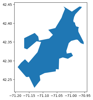
Figure 1. GeoPandas’ geometry can handle the oddly-shaped Suffolk County, MA.
The next code block creates a simplified version containing only the FIPS, NAME, and geometry columns:
counties = counties[['FIPS','NAME','geometry']]
counties.info()

    <class 'geopandas.geodataframe.GeoDataFrame'>
    RangeIndex: 3234 entries, 0 to 3233
    Data columns (total 3 columns):
     #   Column    Non-Null Count  Dtype
    ---  ------    --------------  -----
     0   FIPS      3234 non-null   object
     1   NAME      3234 non-null   object
     2   geometry  3234 non-null   geometry
    dtypes: geometry(1), object(2)
    memory usage: 75.9+ KB
Matching the two Datasets
In order for Folium to match records from one DataFrame with the other, they need to share a common variable. In this case, you’ll use the counties’ Federal Information Processing Standard (FIPS) code. Many datasets of county-level data include this FIPS code, but unfortunately the Fatal Force database does not, so this lesson will first teach you how to add it.
You can use the latitude and longitude values in ff_df to map a FIPS code to each record. What percentage of the records already have these values?
print(ff_df['latitude'].notna().sum())

    7,496

ff_df['latitude'].notna().sum() / len(ff_df)

    0.8900340100999691
This shows that 7,496 rows contain latitude values, which is about 89% of all records.
If you wanted to use this data for a study or report, finding the missing values would be important. For example, the Google Maps API can provide latitude/longitude data from a street address. But since exploring these techniques goes beyond the goals of this lesson, the next line of code will simply create a smaller version of the DataFrame that retains only rows with coordinate data:
ff_df = ff_df[ff_df['latitude'].notna()]
You can now map the FIPS values from counties onto the ff_df records using their latitude and longitude data. For this, you’ll use the GeoPandas method spatial join, which is syntatically similar to a Pandas join. But, where the latter only matches values from one DataFrame to values in another, the spatial join examines coordinate values, matches them to geographic region data, and returns the associated FIPS code.
To prepare the spatial join, you will first create a new field in the ff_df DataFrame to combine the latitude and longitude columns into a single point data type.
.points_from_xy, where longitude (x) must be specified before latitude (y), contrary to the standard way in which map coordinates are referenced.
Additionally, you need to tell GeoPandas which coordinate reference system (CRS) to use. The CRS is a type of mathematical model that describes how latitude and longitude data (points on the surface of a sphere) are presented on a flat surface. For this lesson, the most important thing to know is that both DataFrames need to use the same CRS before being joined.
The next code block ties all this together. It:
- Uses GeoPandas (
gpd) to add a points column toff_dfand tells it to use a specific CRS - Uses GeoPandas to convert
ff_dffrom a Pandas to a GeoPandas DataFrame - Converts
countiesto the same CRS
ff_df['points'] = gpd.points_from_xy(ff_df.longitude, ff_df.latitude, crs="EPSG:4326")
ff_df = gpd.GeoDataFrame(data=ff_df,geometry='points')

counties = counties.to_crs('EPSG:4326')
counties.crs

    <Geographic 2D CRS: EPSG:4326>
    Name: WGS 84
    Axis Info [ellipsoidal]:
    - Lat[north]: Geodetic latitude (degree)
    - Lon[east]: Geodetic longitude (degree)
    Area of Use:
    - name: World.
    - bounds: (-180.0, -90.0, 180.0, 90.0)
    Datum: World Geodetic System 1984 ensemble
    - Ellipsoid: WGS 84
    - Prime Meridian: Greenwich
This is a lot of preparation, but now that the two DataFrames are properly set up, you can use the spatial join geopandas.sjoin() to add FIPS data to each row of the ff_df DataFrame. left_df and right_df specify which two DataFrames are to be matched, and how= tells GeoPandas that it should treat the left DataFrame as primary. This means that it will add the matching data from the right DataFrame (counties) to the left (ff_df).
ff_df = gpd.sjoin(left_df = ff_df,
                  right_df = counties,
                  how = 'left')

ff_df.info()

    <class 'geopandas.geodataframe.GeoDataFrame'>
    Int64Index: 8636 entries, 0 to 9629
    Data columns (total 23 columns):
     #   Column                      Non-Null Count  Dtype
    ---  ------                      --------------  -----
     0   id                          7496 non-null   int64
     1   date                        7496 non-null   datetime64[ns]
     2   threat_type                 7487 non-null   object
     ...
     18  agency_ids                  7496 non-null   object
     19  points                      7496 non-null   geometry
     20  index_right                 7489 non-null   float64
     21  FIPS                        7489 non-null   object
     22  NAME                        7489 non-null   object
    dtypes: bool(2), datetime64[ns](1), float64(4), geometry(1), int64(1), object(14)
    memory usage: 1.3+ MB
Creating your First Map
Now that you’ve added the FIPS data from counties into the ff_df DataFrame, you’re ready to draw a map with Folium. The first map you’ll try will count the number of times people have been killed by police officers in each county and produce a choropleth map that shows, via color and shading, which counties have larger or smaller kill counts.
Counting the Data by County
Since each record in ff_df represents one person killed by a police officer, counting the number of times each county FIPS code appears in the DataFrame will report the number of people killed in that given county. To do this, you can simply execute the .value_counts() method on the FIPS column. Because .value_counts() returns a series, the .reset_index() method turns the series into a new DataFrame, map_df, that will be used in the mapping process:
map_df = ff_df[['FIPS']].value_counts().reset_index()
map_df
| FIPS | count | |
|---|---|---|
| 0 | 06037 | 341 |
| 1 | 04013 | 224 |
| ….. | …… | …… |
| 1591 | 01041 | 1 |
| 1592 | 01039 | 1 |
Length: 1593, dtype: int64
This shows that around 50% (1,593 of 3,234) of US counties have had at least one instance of a police officer killing someone.
map_df.rename(columns={0:'count'})
Initializing a Basic Map
To create a map, Folium will need to initalize a folium.Map object. This lesson will do this repeatedly through the following function:
def initMap():
    tiles = 'https://server.arcgisonline.com/ArcGIS/rest/services/World_Topo_Map/MapServer/tile/{z}/{y}/{x}'
    attr = 'Tiles © Esri — Esri, DeLorme, NAVTEQ, TomTom, Intermap, iPC, USGS, FAO, NPS, NRCAN, GeoBase, Kadaster NL, Ordnance Survey, Esri Japan, METI, Esri China (Hong Kong), and the GIS User Community'

    center = [40,-96]

    map = folium.Map(location=center,
                zoom_start = 5,
                tiles = tiles,
                attr = attr)
    return map
The maps created by Folium are interactive: you can zoom in and out, and move the map around (using your mouse) to examine the area(s) in which you are most interested. To ensure the map is initially located over the center of the continential USA, the location= parameter tells Folium to use center = [40,-96] – a set of coordinate values – as the middle of the map. Because I find the default zoom level (zoom_start = 10) too large to show the continental USA well, the zoom level is set to 5 in the function above. (You can check Folium’s default values for many of its parameters.)
Folium requires you to attribute specific map tiles (the underlying visual representation of the map): see the Leaflet gallery for examples, along with values for tiles= and attr=.
The next line calls the function and assigns the data to a new baseMap variable:
baseMap = initMap()
The following code then processes the data and turns it into a map (line numbers added for clarity):
1 folium.Choropleth(
2        geo_data = counties,
3        data = map_df,
4        key_on = 'feature.properties.FIPS',
5        columns = ['FIPS','count'],
6        bins = 9,
7        fill_color = 'OrRd',
8        fill_opacity = 0.8,
9        line_opacity = 0.2,
10       nan_fill_color = 'grey',
11       legend_name = 'Number of Fatal Police Shootings (2015-present)'
12       ).add_to(baseMap)
13
14 baseMap
- Line 1 calls the
folium.Choropleth()method and Line 12 adds it to the map object initalized earlier. The method plots a GeoJSON overlay ontobaseMap. - Line 2 (
geo_data =) identifies the GeoJSON source of the geographic geometries to be plotted. This is thecountiesDataFrame downloaded from the US Census bureau. - Line 3 (
data =) identifies the source of the data to be analyzed and plotted. This is themap_dfDataFrame (counting the number of kills above 0 in each county), pulled from the Fatal Force DataFrameff_df. - Line 4 (
key_on =) identifies the field in the GeoJSON data that will be bound (or linked) to the data from themap_df. As noted earlier, Folium needs a common column between both DataFrames: here, theFIPScolumn. - Line 5 is required because the data source is a DataFrame. The
column =parameter tells Folium which columns to use.- The first list element is the variable that should be matched with the
key_on =value. - The second element is the variable to be used to draw the choropleth map’s colors.
- The first list element is the variable that should be matched with the
- Line 6 (
bins =) specifies how many bins to sort the data values into. (The maximum number is limited by the number of colors in the color palette selected, often 9.) - Line 7 (
fill_color =) specifies the color palette to use. Folium’s documentation identifes the following built-in palettes: ‘BuGn’, ‘BuPu’, ‘GnBu’, ‘OrRd’, ‘PuBu’, ‘PuBuGn’, ‘PuRd’, ‘RdPu’, ‘YlGn’, ‘YlGnBu’, ‘YlOrBr’, and ‘YlOrRd’. - Lines 8 (
fill_opacity =) and 9 (line_opacity =) specify how opaque the overlay should be. The values range from 0 (transparent) to 1 (completely opaque). I like being able to see through the color layer a bit, so I can see city names, highways, etc. - Line 10 (
nan_fill_color =) tells Folium which color to use for counties lacking data (NaN stands for ‘not a number’, which is what Pandas uses when missing data). This color should be distinct from the palette colors, so it is clear that data is missing. - Line 11 (
legend_name =) allows you to label the scale. This is optional but helpful, so people know what they’re reading. -
Line 14 simply displays the map:
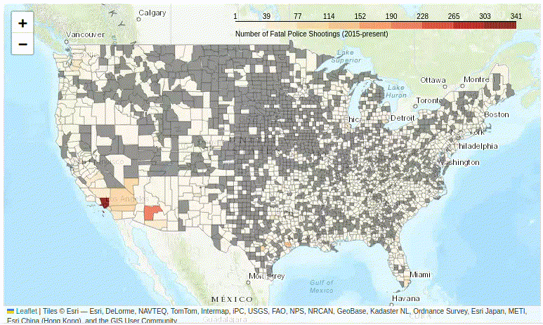
Figure 2. A basic interactive Folium choropleth map.
The Problem of Unevenly Distributed Data
Unfortunately, this basic map (Figure 2) is not terribly informative… The whole United States consist of basically only two colors:
- The grey counties are those for which the Post have not recorded any cases of fatal police shootings. This represents about 50% of US counties.
- Almost all the rest of the country is pale yellow, except for a few major urban areas, such as Los Angeles.
Why is this? The clue is to look at the scale, which ranges from 0 to 341.
Pandas’ .describe() method provides a useful summary of your data, including the mean, standard deviation, median, and quartile information:
map_df.describe()
| count | |
|---|---|
| count | 1593.000000 |
| mean | 5.406642 |
| std | 14.2966701 |
| min | 1.000000 |
| 25% | 1.000000 |
| 50% | 2.000000 |
| 75% | 5.000000 |
| max | 341.000000 |
This shows:
- 1,593 counties (out of the 3,142) have reported at least one police killing.
- At least 75% of these 1,596 counties have had 5 or fewer killings. Thus, there must be a few counties in the top quartile that have had many more killings.
A boxplot is a useful tool for visualizing this distribution:
map_df.boxplot(vert=False)
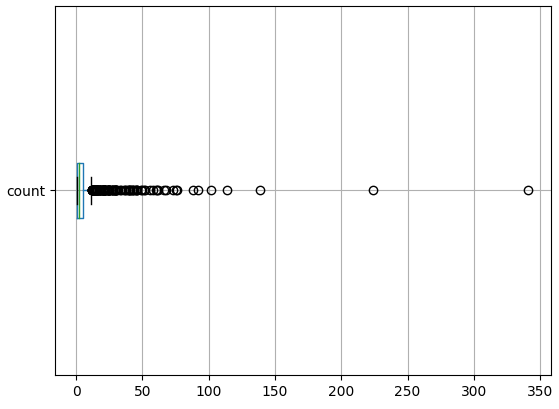
Figure 3. Distribution of police killings per county.
Although imperfect, this allows us to see that there are fewer than ten counties in which police have killed more than ~75 civilians.
Folium does not handle such uneven data distributions very well. Its basic algorithm divides the data range into a number of equally sized ‘bins’. This is set to 9 (in Line 6 above), so each bin is about 38 units wide (\(341 / 9 = 37.8\)).
- Bin 1 (0 - 38) contains almost all the data (since 75% of all all values are 5 or less).
- Bin 2 (38 - 76) contains almost all the remaining data, judging by the boxplot in Figure 3.
- Bin 3 (76 - 114) has a handful of cases.
- Bin 4 (114 - 152) has 2 cases.
- Bin 5 (152 - 190) has 0 cases.
- Bin 6 (190 - 228) has 1 case.
- Bins 7 and 8 (228 - 304) have 0 cases.
- Bin 9 (304 - 341) has 1 case.
Because the scale needs to cover all cases (0 to 341 killings), when the vast majority of cases are contained in just one or two bins, the map becomes somewhat uninformative: bins 4 - 9 are shown, but represent only 4 counties combined.
There are solutions to this problem, but none are ideal; some work better with some distributions of data than others. Mapmakers may need to experiment to see what map works best for a given set of data.
Solution 1: The Fisher-Jenks Algorithm
Folium allows you to specify use_jenks = True to the choropleth algorithm, which will automatically calculate ‘natural breaks’ in the data. Folium’s documentation says ‘this is useful when your data is unevenly distributed.’
To use this parameter, Folium relies on the jenkspy library. jenkspy is not part of Colab’s standard collection of libraries, so you must install it with the pip command. Colab (following the Jupyter notebook convention) allows you to issue terminal commands by prefixing the command with an exclaimation point:
! pip install jenkspy
Now that the jenkspy library is installed, you can pass the use_jenks parameter to Folium and redraw the map:
baseMap = initMap()
 # If the map variable isn't re-initialized, Folium will add a new set of choropleth data
 # on top of the old data.

folium.Choropleth(
        geo_data = counties,
        data = map_df,
        columns = ['FIPS','count'],
        key_on = 'feature.properties.FIPS',
        bins = 9,
        fill_color='OrRd',
        fill_opacity=0.8,
        line_opacity=0.2,
        nan_fill_color = 'grey',
        legend_name='Number of Fatal Police Shootings (2015-present)',
        use_jenks = True # <-- this is the new parameter being passed to Folium
        ).add_to(baseMap)

baseMap
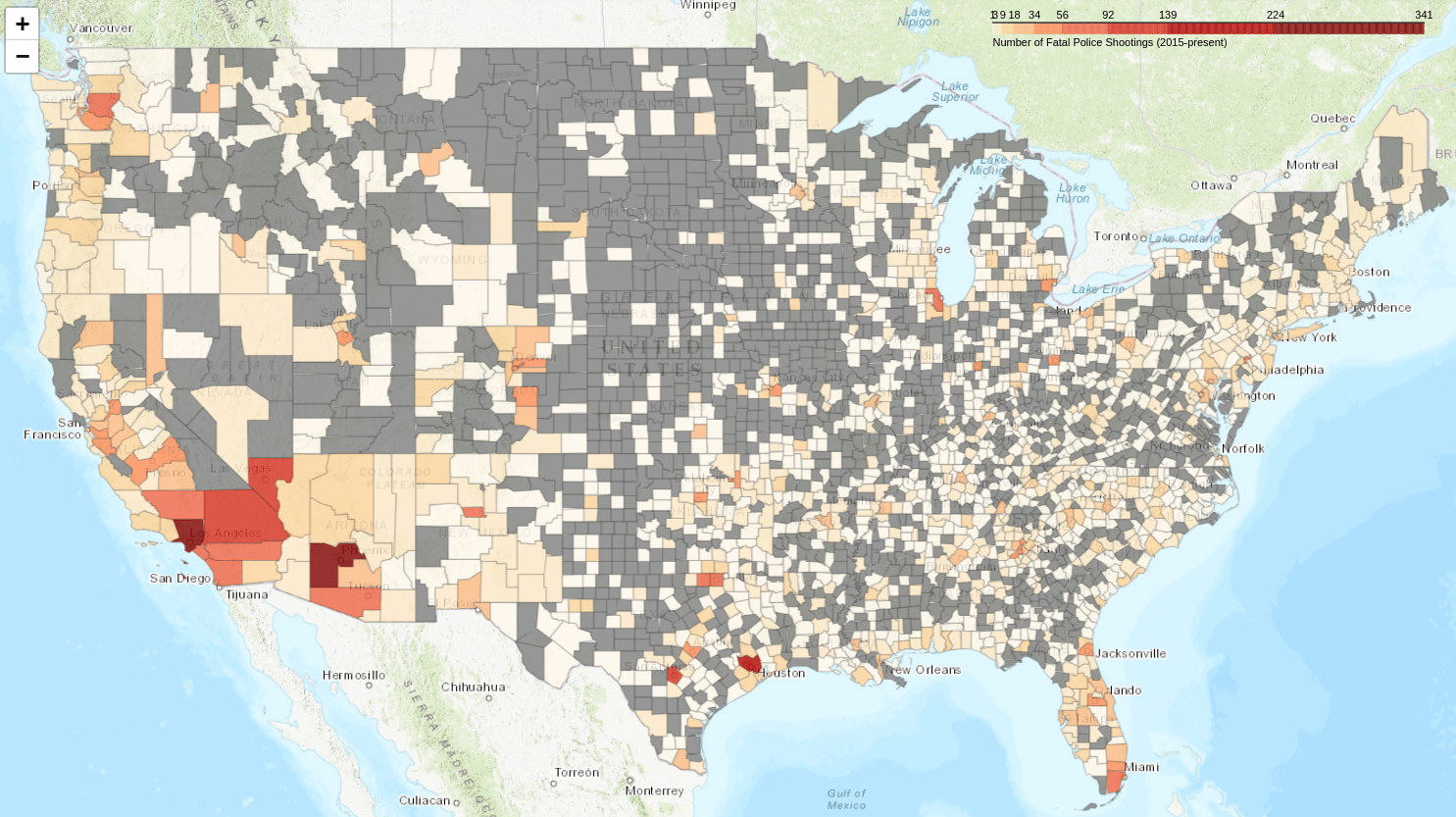
Figure 4. The map colorized by the Fisher-Jenks algorithm.
This is already an improvement: the map shows a better range of contrasts. A higher number of counties outside the Southwest where police have killed several people (Florida, the Northwest, etc.) are now visible. However, the scale is almost impossible to read! The algorithm correctly found natural breaks – most of the values are less than 92 – but at the lower end of the scale, the numbers are illegible.
Solution 2: Creating a Logarithmic Scale
Logarithmic scales are useful when the data is not normally distributed. The definition of a logarithm is \(b^r = a\) or \(\log_b a = r\). That is, the log value is the exponent, \(r\), to which the base number, \(b\), should be raised to equal the original value, \(a\).
For base 10, this is easy to calculate:
- \(10 = 10^1\) so \(\log_{10}(10) = 1\)
- \(100 = 10^2\) so \(\log_{10}(100) = 2\)
Thus, using a base 10 logarithm, each time a log value increases by 1, the original value increases 10 times. The most familiar example of a \(\log_{10}\) scale is probably the Richter scale, used to measure earthquakes.
Since most counties have under 5 killings, their \(\log_{10}\) value would be between 0 and 1. The highest values (up to 302) have a \(\log_{10}\) value between 2 and 3 (that is, the original values are between \(10^2\) and \(10^3\)).
You can easily add a \(\log_{10}\) scale variable using numpy’s .log10() method to create a column called MapScale (you imported numpy as np at the beginning of the lesson):
map_df['MapScale'] = np.log10(map_df['count'])
Displaying a Logarithm Scale
The problem with a log scale is that most people won’t know know to interpret it: what is the original value of 1.5 or 1.8 on a \(\log_{10}\) scale? Even people who remember the definition of logarithm (that is, that when the scale says 1.5, this means the non-log value is \(10^{1.5}\)), won’t be able to convert the log values back to the original number without a calculator! Unfortunately, Folium doesn’t have a built-in way to address this problem.
You can fix this by deleting the legend created by Folium (which displays log values) and replacing it with a new legend created by the branca library. The legend includes a) the shaded bar (colormap) that shows the different colors on the map, b) a set of numerical values (called tick values), and c) a text caption.
The following code:
- Gets the numerical values generated by Folium.
- Deletes the legend created by Folium.
- Creates a new legend:
- Generates a new shaded bar, saved to the
colormapobject variable. - Creates new numerical values by converting the log values to their non-log equlivants. These are added to the
colormapas an attribute. - Adds a caption to
colormapas an attribute
- Generates a new shaded bar, saved to the
- Adds the revised legend (
colormap) to the baseMap.
Here’s the full code with the branca fragment included:
baseMap = initMap()

cp = folium.Choropleth( #<== you need to create a new variable (here, 'cp' for choropleth) used by branca to access the data
        geo_data = counties,
        data = map_df,
        columns = ['FIPS','MapScale'],
        key_on = 'feature.properties.FIPS',
        bins = 9,
        fill_color='OrRd', # < == this needs to match the used below
        fill_opacity=0.8,
        line_opacity=0.2,
        nan_fill_color = 'grey'
        ).add_to(baseMap)

import branca.colormap as cm

log_value_ticks = cp.color_scale.index # get the default legend's numerical values

# Remove the default legend
for key in list(cp._children.keys()):
    if key.startswith('color_map'):
        del cp._children[key]

min_value = round(10**log_value_ticks[0])
max_value = round(10**log_value_ticks[-1])
colormap = cm.linear.OrRd_09.scale(min_value,max_value) # note this needs to match the 'fill_color' specified earlier

tick_values = [round(10**x) for x in log_value_ticks]
colormap.custom_ticks = tick_values

colormap.caption = 'Number of Fatal Police Shootings (2015-present)'

colormap.add_to(baseMap)

baseMap
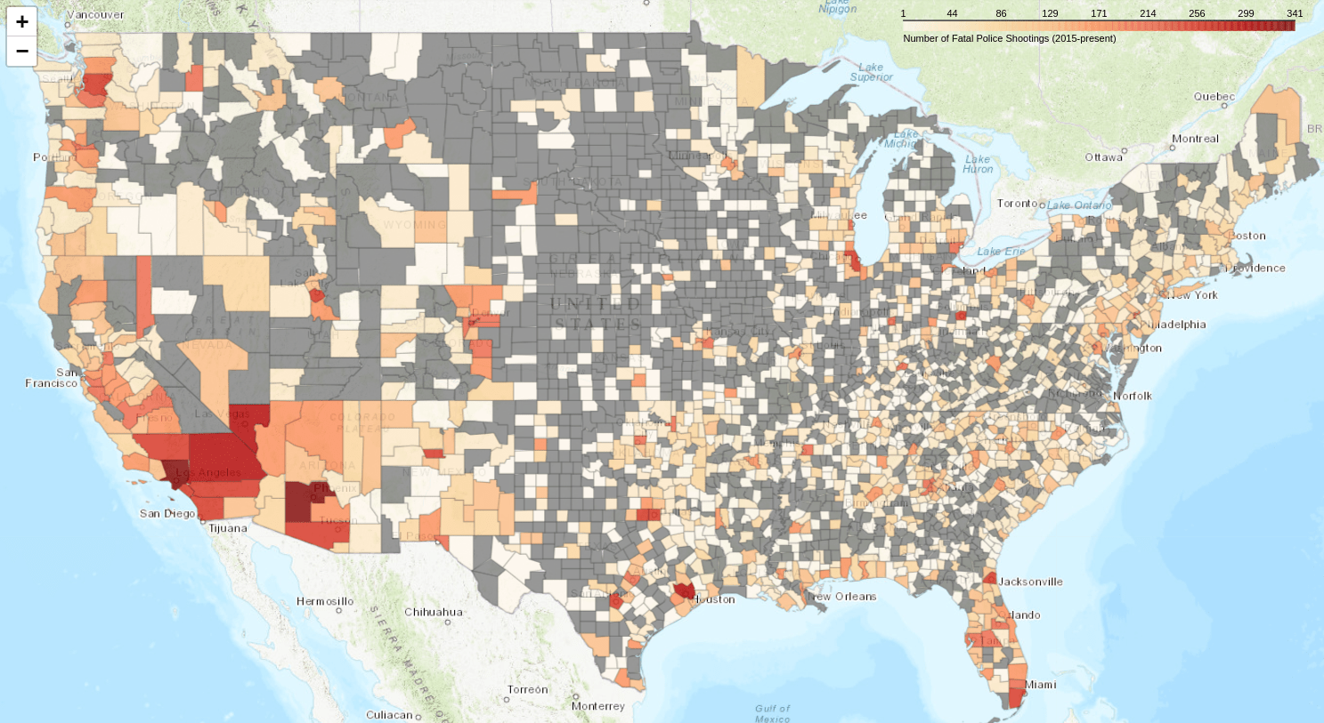
Figure 5. The map colorized with a log scale, with non-log values on the scale.
Note that the log values on the scale have been converted to the original (non-log) values. Although the bins are back to equal size, their values now increase exponentially.
Normalizing Population Data
Figure 5 demonstrates a common characteristic of choropleth maps: the data tends to correlate closely with population centers. The counties with the largest number of police killings of civilians are those with large populations (Los Angeles, California; Cook, Illinois; Dade, Florida; etc.). The same trend would arise for maps showing ocurrences of swine flu (correlated with pig farms), or corn leaf blight (correlated with regions that grow corn).
Choropleth maps are often more accurate when they visualize rates rather than raw values: for example, the number of cases per 100,000 population. Converting the data from values to rates is called ‘normalizing’ data.
Getting County-level Population Data
In order to normalize the population data, your dataset needs to include the population numbers for each county.
Looking through the available US Census Bureau datasets, I found that the co_est2019-alldata.csv contains this information. Pandas’ .read_csv() method allows you to specify which columns to import with the usecols parameter. In this case, you only need STATE,COUNTY, and POPESTIMATE2019 (I selected 2019 because the Post’s data extends from 2015 to present; 2019 is roughly in the middle of that time frame).
#url = 'https://www2.census.gov/programs-surveys/popest/datasets/2010-2019/counties/totals/co-est2019-alldata.csv'
url = 'https://raw.githubusercontent.com/programminghistorian/jekyll/gh-pages/assets/choropleth-maps-python-folium/co-est2019-alldata.csv'

pop_df = pd.read_csv(url,
                     usecols = ['STATE','COUNTY','POPESTIMATE2019'],
                     encoding = "ISO-8859-1")
pop_df.info()

    <class 'pandas.core.frame.DataFrame'>
    RangeIndex: 3193 entries, 0 to 3192
    Data columns (total 3 columns):
     #   Column           Non-Null Count  Dtype
    ---  ------           --------------  -----
     0   STATE            3193 non-null   int64
     1   COUNTY           3193 non-null   int64
     2   POPESTIMATE2019  3193 non-null   int64
    dtypes: int64(3)
    memory usage: 75.0 KB
utf-8 encoding scheme; I needed to specify "ISO-8859-1" to avoid a UnicodeDecodeError.
In the counties DataFrame, the FIPS varible was an object (string) data type. In this DataFrame, Pandas imported STATE and COUNTY as integers. Let’s combine these values into the FIPS county code. The code block below:
- Converts the numbers to string values with .astype(str)
- Adds leading zeros with .str.zfill
- Combines the two variables to create a string type
FIPScolumn
pop_df['STATE'] = pop_df['STATE'].astype(str).str.zfill(2) # convert to string, and add leading zeros
pop_df['COUNTY'] = pop_df['COUNTY'].astype(str).str.zfill(3)
pop_df['FIPS'] = pop_df['STATE'] + pop_df['COUNTY'] # combine the state and county fields to create a FIPS
pop_df.head(3)
| STATE | COUNTY | POPESTIMATE2019 | FIPS | |
|---|---|---|---|---|
| 0 | 01 | 000 | 4903185 | 01000 |
| 1 | 01 | 001 | 55869 | 01001 |
| 2 | 01 | 003 | 223234 | 01003 |
This DataFrame includes population estimates for both entire states (county code 000) and individual counties (county code 001 and up). Row 0 reports the total population for state 01 (Alabama), while Row 1 reports the population for county 001 of Alabama (Autauga).
Since the DataFrames we’ve used so far don’t include state rows (FIPS code XX-000), these totals will be ignored by Pandas when it merges this DataFrame into map_df.
Adding County Population Data to the Map DataFrame
The merge method lets you add the county-level population data from pop_df to map_df, matching to the FIPS column and using the left DataFrame (map_df) as primary.
map_df = map_df.merge(pop_df, on = 'FIPS', how = 'left')
map_df.head(3)
| FIPS | count | MapScale | STATE | COUNTY | POPESTIMATE2019 | |
|---|---|---|---|---|---|---|
| 0 | 06037 | 341 | 2.532754 | 06 | 037 | 10039107.0 |
| 1 | 04013 | 224 | 2.230248 | 04 | 013 | 4485414.0 |
| 2 | 48201 | 139 | 2.143015 | 48 | 201 | 4713325.0 |
The snippet of map_df above shows that it contains all the columns you’ve added so far in this lesson. At this point, the only columns you need are FIPS, count, and POPESTIMATE2019, so you could decide to tidy it up a bit – but as it’s a relatively small DataFrame (around 3,100 rows), there isn’t a pressing reason to do so.
Calculating the Rate of People Killed (per 100k)
You can now use the code below to calculate the number of people killed per 100,000 people within each county. It divides the count variable by the county population over 100,000, and stores it in the new column count_per_100k:
map_df['count_per_100k'] = map_df['count'] / (map_df['POPESTIMATE2019']/100000)
map_df.head(3))
| FIPS | count | MapScale | STATE | COUNTY | POPESTIMATE2019 | count_per_100k | |
|---|---|---|---|---|---|---|---|
| 0 | 06037 | 341 | 2.532754 | 06 | 037 | 10039107.0 | 3.396716 |
| 1 | 04013 | 224 | 2.230248 | 04 | 013 | 4485414.0 | 4.993965 |
| 2 | 48201 | 139 | 2.143015 | 48 | 201 | 4713325.0 | 2.949086 |
Recreating the Map with Rates instead of Raw Counts
Now, you’re ready to plot the number of police killing per 100,000 people in each county. The only change required to the Folium code is to modify the columns=[ ] parameter to specify that it should use count_per_100k as the variable to color the map:
baseMap = initMap()

cp = folium.Choropleth(
        geo_data = counties,
        data = map_df,
        columns = ['FIPS','count_per_100k'], # <= change the variable to use on the map
        key_on = 'feature.properties.FIPS',
        bins = 9,
        fill_color='OrRd',
        fill_opacity=0.8,
        line_opacity=0.2,
        nan_fill_color = 'grey',
        legend_name='Number of Fatal Police Shootings per 100k (2015-present)'
        ).add_to(baseMap)

baseMap
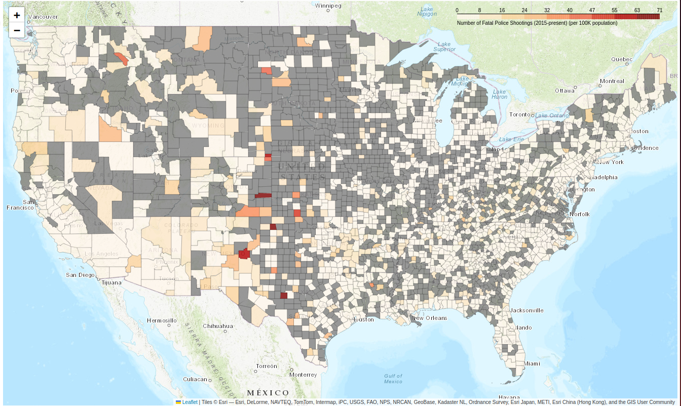
Figure 06. The number of police killings per 100k.
Now, high population counties (like Los Angeles and Cook) don’t appear so bad. Instead, low population counties with a single shooting are shown in dark red.
Uneven Distribution of Normalized Data
Earlier, you saw that the distribution of the count variable was wildly uneven. Is count_per_100k any better?
map_df['count_per_100k'].describe()

    count    1592.000000
    mean        5.478997
    std         6.133703
    min         0.179746
    25%         2.164490
    50%         3.793155
    75%         6.634455
    max        71.123755
    Name: count_per_100k, dtype: float64
map_df.boxplot(column=['count_per_100k'],vert=False)
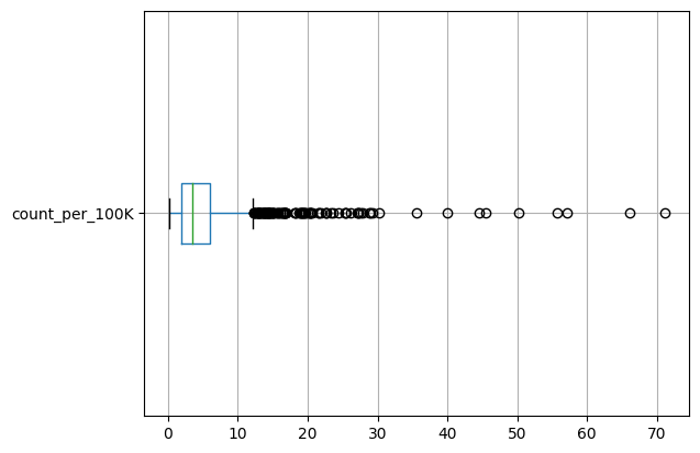
Figure 07. The distribution of the number of police killings per 100k.
Again, this is an uneven distribution with a high number of outliers. Using a log scale may result in a more normal distribution:
map_df['MapScale'] = np.log10(map_df['count_per_100k'])
map_df.boxplot(column=['MapScale'],vert=False)
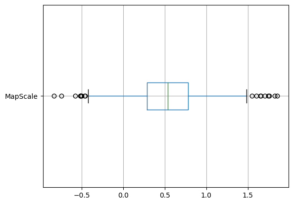
Figure 08. Boxplot of police killings per 100k using a log scale.
This conversion transforms a skewed distribution into a more normal distribution of log values.
To plot the log values on the map instead, you only need to make another small adjustment to the Folium code so that is maps the MapScale variable. Below, I’ve also added the code to display the non-log values on the scale:
baseMap = initMap()

folium.Choropleth(
        geo_data = counties,
        data = map_df,
        columns = ['FIPS','MapScale'], # <= change to use MapScale as basis for colors
        key_on = 'feature.properties.FIPS',
        bins = 9,
        fill_color='OrRd',
        fill_opacity=0.8,
        line_opacity=0.2,
        nan_fill_color = 'grey',
        #legend_name='Number of Fatal Police Shootings per 100 (2015-present)'
        ).add_to(baseMap)

# replace the default log-value legend with non-log equlivants
import branca.colormap as cm

log_value_ticks = cp.color_scale.index

for key in list(cp._children.keys()):
    if key.startswith('color_map'):
        del cp._children[key]

min_value = round(10**log_value_ticks[0])
max_value = round(10**log_value_ticks[-1])
colormap = cm.linear.OrRd_09.scale(min_value,max_value)

tick_values = [round(10**x) for x in log_value_ticks]
colormap.custom_ticks = tick_values

colormap.caption = 'Number of Fatal Police Shootings per 100K population (2015-present)'

colormap.add_to(baseMap)

baseMap
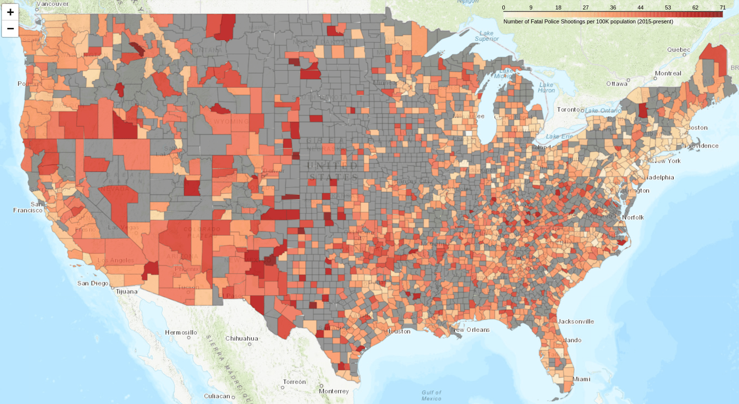
Figure 09. The number of police killings per 100k using a log scale.
Normalizing the data dramatically changes the appearance of the map. The initial visualization (Figure 2) suggested that the problem of police killing civilians was limited to a few counties, generally those with large populations. But when the data is normalized, police killings of civilians seem far more widespread. The counties with the highest rates of killings are those with lower population numbers. Trying to illustrate this issue with charts or tables would not be nearly as effective.
Adding an Information Box to the Map
In the process of creating the map above (Figure 9), you gathered various useful pieces of information: the number of people killed in each county by police, the county population, the rate of people killed, etc. Folium allows you to display such information in a floating information box (using folium.GeoJsonTooltip()) that will show as the user hovers their cursor across the map. This is very helpful, especially when examining areas one may not be familiar with – but it is a little complicated to get set up correctly.
When Folium creates a choropleth map, it generates underlying GeoJSON data about each geographic region. You can see this data by saving it to a temporary variable such as cp. This variable was used earlier to create the log scale; it can be used again to store data from the folium.Choropleth() method for other uses:
baseMap = initMap()

cp = folium.Choropleth( # <- add the 'cp' variable
        geo_data = counties,
        data = map_df,
        columns = ['FIPS','MapScale'],
        key_on = 'feature.properties.FIPS',
        bins = 9,
        fill_color='OrRd',
        fill_opacity=0.8,
        line_opacity=0.2,
        nan_fill_color = 'grey',
        legend_name='Number of Fatal Police Shootings (2015-present)'
        ).add_to(baseMap)
Here’s what some of the GeoJson data looks like:
[{'id': '0',
  'type': 'Feature',
  'properties': {'FIPS': '01059', 'NAME': 'Franklin'}, # <= dictionary of K/V pairs
  'geometry': {'type': 'Polygon',
   'coordinates': [[[-88.16591, 34.380926],
     [-88.165634, 34.383102],
     [-88.156292, 34.463214],
     [-88.139988, 34.581703],
     [-88.16591, 34.380926]]]},
  'bbox': [-88.173632, 34.304598, -87.529667, 34.581703]},
 {'id': '1',
  'type': 'Feature',
  'properties': {'FIPS': '06057', 'NAME': 'Nevada'}, # <= dictionary of K/V pairs
  'geometry': {'type': 'Polygon',
   'coordinates': [[[-121.27953, 39.230537],
     [-121.259182, 39.256421],
     [-121.266132, 39.272717],
     ...
The JSON data format is a standard way of sending information around the internet. Users familiar with Python will notice that it resembles a list of nested dictionary values. The example above shows that county properties are key:value pairs. County 0’s FIPS key has a value of 01059; its NAME key has the value ‘Franklin’.
Adding Data to the GeoJSON Property Dictionary
Unfortunately, the GeoJSON data above doesn’t currently hold all the information you’ve generated so far. You can supplement it by iteratively selecting the desired information from the map_df DataFrame and adding it to the GeoJSON property dictionary. Here’s how to do this:
- Create a
map_data_lookupDataFrame that copies themap_df, usingFIPSas its index. - Iterate over the GeoJSON data and add new property variables using data from
map_df.
In the code below, I’ve added line numbers to clarify the subsequent explanation:
1. map_data_lookup = map_df.set_index('FIPS')

2. for row in cp.geojson.data['features']:
3.   try:
4.       row['properties']['count'] = f"{(map_data_lookup.loc[row['properties']['FIPS'],'count']):.0f}"
5.   except KeyError:
6.      row['properties']['count'] = 'No police killings reported'
-
Line 1 creates a new DataFrame from
map_dfand sets its index to theFIPScode. This is important because the GeoJSON data includesFIPSinformation. The code therefore uses it to find corresponding data in themap_dfDataFrame. -
Line 2 iterates over the GeoJSON data, examining each county.
-
Line 4 is where all the work happens, so let’s look at it closely:
row['properties']['count'] adds the count key to the properties dictionary.
f"{(map_data_lookup.loc[row['properties']['FIPS'],'count']):.0f}" assigns a value to this key.
To understand this last bit of code, let’s read it from the inside out:
.locreturns a value from a DataFrame based on itsindex valueandcolumn name. In its simplist form, it looks likevalue = df.loc[index,col].- Because
map_data_lookup’s index is theFIPScode, if you supply aFIPSand a column name ('count'), Pandas will search the table for the corresponding FIPS number and return the number in thecountcolumn. - As it iterates over the rows in the GeoJSON data, the
row['properties']['FIPS']will supply theFIPSvalue for which to search.
At this point, map_data_lookup.loc[row['properties']['FIPS'],'count'] has tried to find the count value for every given FIPS. If found, it is returned as an integer. However, to display it properly, you need to convert it to a string, by wrapping the value in an f-string and specifying no decimals: (f"{count:.0f}").
-
The
try:andexcept:statements in lines 3 and 5 prevent the program from terminating if it encounters aKeyError, which happens when no data is found by.loc[]. Since the GeoJSON data includes values for all the counties in the US, butmap_data_lookuponly includes values for counties with 1 or more killings, about 50% of the.loc[]searches will return no data – causing aKeyError! -
Line 6 gives a default value (‘No police killings reported’) when a
KeyErroris encountered.
Now that you’ve updated Folium’s GeoJSON data, you can call the folium.GeoJsonTooltip() method. This will allow you to display values from the property dictionary, and let you specify ‘aliases’: the text you want to display in your tooltip box.
Finally, you update the cp.geojson variable, which Folium will use to create the new map.
folium.GeoJsonTooltip(['NAME','count'],
                      aliases=['County:','Num of Police Killings:']).add_to(cp.geojson)
Adding Multiple Data Elements to the Information Box
In the example just above, you only reported the number of police killings (count) – but with this technique, you can display multiple variables at once. In the next example, you create an information box that displays:
- The county name (already in the
cp.GeoJsonproperty dictionary) - The number of people killed by police
- The county’s population
- The number of people killed per 100k
The last two variables also need to be added to the cp.GeoJson property dictionary:
baseMap = initMap()

cp = folium.Choropleth(
        geo_data = counties,
        data = map_df,
        columns = ['FIPS','MapScale'],
        key_on = 'feature.properties.FIPS',
        bins = 9,
        fill_color='OrRd',
        fill_opacity=0.8,
        line_opacity=0.2,
        nan_fill_color = 'grey',
        legend_name='Number of Fatal Police Shootings per 100k (2015-present)'
        ).add_to(baseMap)

map_data_lookup = map_df.set_index('FIPS')

for row in cp.geojson.data['features']:
  try:
      row['properties']['count'] = f"{(map_data_lookup.loc[row['properties']['FIPS'],'count']):.0f}"
  except KeyError:
      row['properties']['count'] = 'No police killings reported'
  try:
      row['properties']['count_per_100k'] = f"{map_data_lookup.loc[row['properties']['FIPS'],'count_per_100k']:.2f}" # present the data with 2 decimal places
  except KeyError:
      row['properties']['count_per_100k'] = 'No data'
  try:
      row['properties']['population'] = f"{map_data_lookup.loc[row['properties']['FIPS'],'POPESTIMATE2019']:,.0f}"
  except KeyError:
      row['properties']['population'] = 'No data'

folium.GeoJsonTooltip(['NAME','population','count','count_per_100k'],
                      aliases=['county:','population:','count:','per100k:']
                      ).add_to(cp.geojson)

baseMap
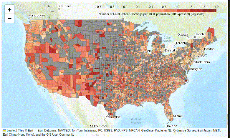
Figure 10. The tooltip plugin displays multiple variables in a floating information box.
Despite its complexity, adding the floating information box dramatically improves the user experience of exploring your map – so do give it a try.
Saving Your Maps
You can easily save your maps as HTML files with the .save() method, which saves the file to Colab’s virtual drive:
baseMap.save('PoliceKillingsOfCivilians.html')
The files you’ve saved to your virtual drive are under the file folder in the left margin of the browser window. Hover your cursor over the file and select Download to save the file to your local hard-drive’s default download folder.
These files can be shared with other people, who can open them in a browser and then zoom, pan, and examine individual county statistics by hovering their cursor over the map.
Conclusion
Choropleth maps are a powerful way to display data and inform readers by allowing them to discern patterns in data that are otherwise difficult to observe. This is especially true for areas with arbitrary boundaries: not knowing the edges of a police precinct, alderperson’s ward, or census tract makes it hard to interpret the meaning of all sorts of data (economic development, income, lead levels in the environment, life expectancy, etc.). But if that data is displayed in a choropleth map (or a series of maps), you might notice correlations between variables that prompt additional investigation.
Acknowledgments
Robert Nelson and Felipe Valdez provided very helpful feedback on drafts of this project. Alex Wermer-Colan helped guide me through the submission and review process. Nabeel Siddiqui’s editorial assistance has been invaluable. Charlotte Chevrie and Anisa Hawes have been patient and helpful preparing this material for the Programming Historian website and shepherding me through the process. I appreciate everyone’s assistance in improving this article; final responsibility, of course, remains mine.
Footnotes
-
Albert Cairo, How Charts Lie: Getting Smarter About Visual Information (W.W. Norton & Company, 2019). ↩
-
Issie Lapowsky, “Is the US Leaning Red or Blue? It All Depends on Your Map,” Wired, July 26, 2018. https://www.wired.com/story/is-us-leaning-red-or-blue-election-maps/. ↩
-
Liuam Tung, “Programming languages: Python just took a big jump forward,” ZDNET, October 06, 2021. https://www.zdnet.com/article/programming-languages-python-just-took-a-big-jump-forward/. ↩
-
Paul Krill, “Python popularity still soaring,” InfoWorld, August 08, 2022. https://www.infoworld.com/article/3669232/python-popularity-still-soaring.html. ↩
-
Samuel Ogunleke, “Why Is Python Popular for Data Science?” MakeUseOf, 14 January, 2022. https://www.makeuseof.com/why-is-python-popular-for-data-science/. ↩
-
Quinn Dombrowski, Tassie Gniady, and David Kloster, “Introduction to Jupyter Notebooks,” Programming Historian, no. 8 (2019), https://doi.org/10.46430/phen0087. ↩